Crowdsourcing aspects of a garden is an enlightening experience.
Last weekend I picked up the gate for the vegetable garden. This is a big deal in this very lengthy project. I am an admirer of garden gates. The best ones ooze charm, teasing you to just dare to walk through them.
But in my garden, which is, for better or worse, quite open, there are no opportunities for gates, which by default divide an area. So I did what any perfectly not-at-all sane gardener would do and I built a garden that needs a gate. I’m kidding, of course. I totally wanted a place to grow some vegetables too.
Long story short, I had what I consider to be my dream garden gate built. I realize that a custom garden gate sounds, well, unnecessary, but it’s entirely possible I’m only going to get one garden gate in my entire life. There’s no way I’m going for the big-box special.
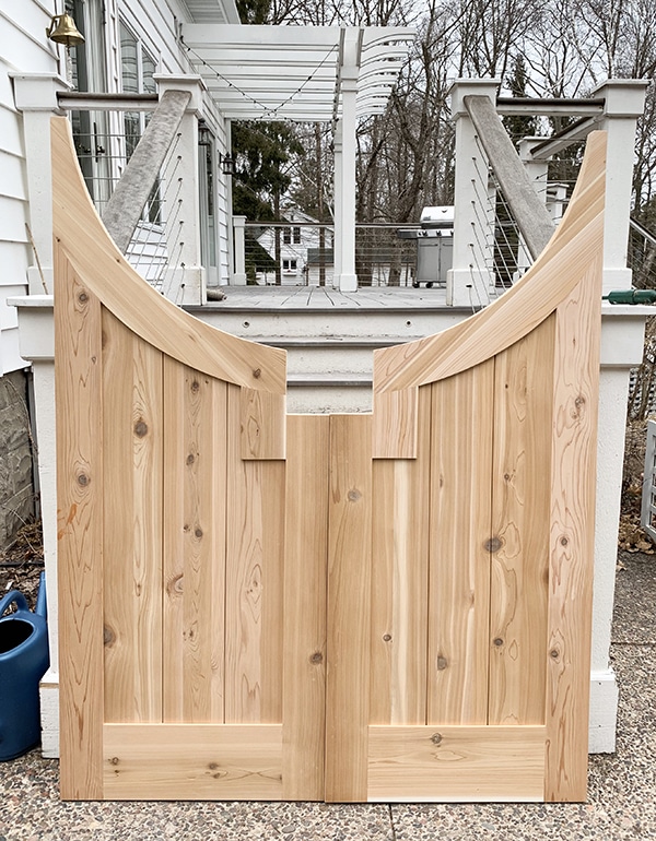
I picked it up on Saturday and by the time the opening credits of “Saturday Night Live” were rolling I had nearly a dozen very rough Photoshop mockups of the gate painted or stained in a variety of colors up on Instagram and Facebook seeking input.
And boy did I get it. There wasn’t a single option that didn’t get a vote, although bright yellow probably got the least votes, just because I said that I’ll be planting apricot climbing roses on the arbor and I guessing people had a hard time pictures that combination, and I felt the same way.
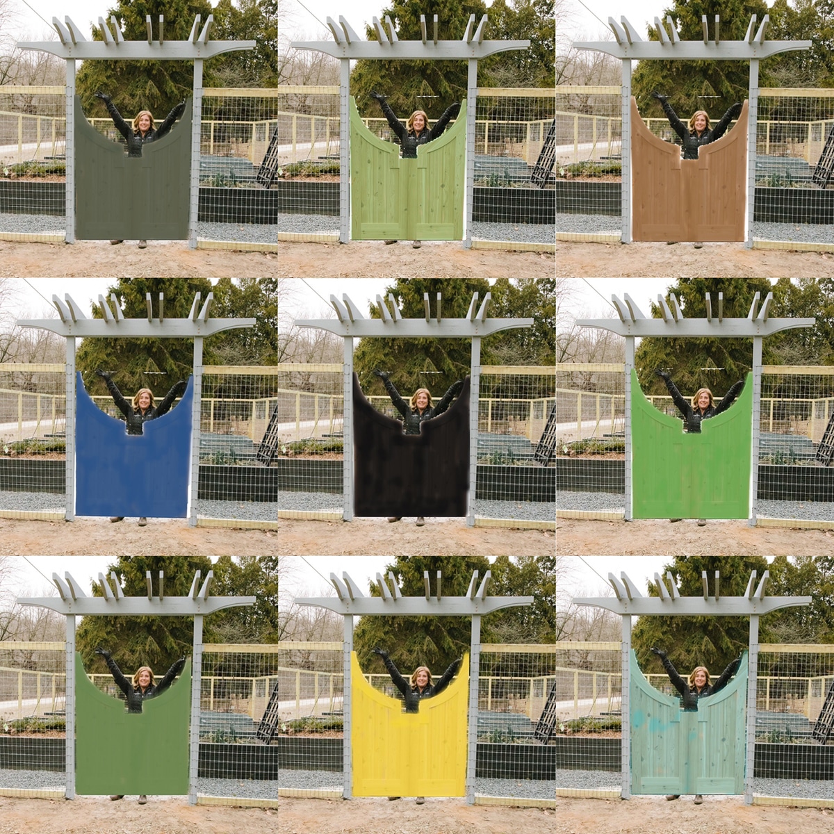
There were a lot of people who liked the idea of keeping the beautiful cedar natural and just clear coating it. In theory I like that too, but I’m not sure I can pass up an opportunity to bring a fun color into the garden. Such opportunities don’t present themselves that often and, let’s be honest, I’m not known for my restraint.
And there were suggestions for colors I hadn’t even thought of: red (love red but not for this), maroon (nope), purple (definitely no; I’m not a purple girl), teal (kind of love it) and even art pieces with vines and flowers on them, which I’m not remotely talented enough to pull off myself.
Some people brought up points I hadn’t thought of that were quite valid, and others made me look at an option in a completely different way.
So what color is this dream gate going to be? I don’t know for sure, but I have it narrowed down to a general color category. And nope, I’m not telling just yet. But I know this: I don’t think there’s a bad option. If hundreds of people can vote and there’s not a clear consensus, I’m pretty confident whatever I pick will be OK.
And if it’s not, one of you can come over and change the color for me.
16 Responses
I am really impressed with those photoshop mockups. I have gotten so computer illiterate after years of doing computer layout and design, that that little project is beyond me anymore. What a great way to help you envision the choices. And so easy to knock a bunch out and get to the best choices.
Center top green or bottom right aqua. I think the aqua would be great with the rose. The green good with anything.
I vote center top as well.
The black color or a Japanese wood burning technique. Or perhaps a muted aubergine. It makes your veggie beds pop. The other colors are gorgeous, but they would look better if you were to use them as an accent, in two gorgeous glazed oversized terra-cotta pots on either side of the entrance. With some climbers to grow on the fence and entry way pergola.
Paint it what ever color makes your heart sing. You can always change it when a whim comes over you. Just not black. No one want to go into a black hole.
I like most of them but I would paint yellow or blue.
I like the one on the bottom right. Aqua hi
I like the aqua on the bottom right.
Hi.
Black is a classic color.
The raised beds are black.
Paint the gate post and overhead a gloss black,
including the fence and post.
You are a classy lady, I suggest you wear
black clothing while working in the garden.
Seriously, cheers, Cap Carl
A do centro superior.
I don’t think it matters! Any color you paint that gate it’s going to be GORGEOUS!! Wow, what a stunner it is!
Turquoise or yellow!
I vote top left or top center. Both look good and natural. The top left complements the arbor and raised bed colors; the center is a soft contrast but not too much of a crayola color. I agree any one will look fine but those are where my preference lies. Good luck.
I like the color in the center top photo. I like how the grain of the wood shows through the stain. It is a very earthy green and will look wonderful with any vegetation, vine or flowers. It is more alive than a brown or black would be and more natural than the other options.
It looks alive ….. something you hope the plants in the garden you are about to enter are, too! By the way, I love the design of your gate. It looks happy and welcoming, kind of like a smile and also takes on shapes from nature – think sun and moon. Good job!
Yellow attracts bugs. I had some yellow chairs once and gnats and other bugs would land on the chairs. I like the turquoise color. Also, if you can find it, I would suggest a semi transparent stain so the grain showed through and so the color lasted longer. Paint tends to chip off. Of course the stain does limit your color choices. I noticed Cabot had quite a few colors in their semi transparent stains. Good luck!