• Home
  • ABOUT
  • VIDEOS
  • Contact
  • SHOP

The Impatient Gardener

Cottage

Construction Update 8: Shades of gray

October 26, 2010

I’ve (and I say I’ve because I get no help whatsoever from Mr. Much-More-Patient on these matters) chosen almost all the paint colors for the remodeled areas of the house and even though I wasn’t conscious of it at the time, it appears I’m really into gray at the moment.

Let’s start with the most important choices: The living room ceiling and walls. Because our living room ceiling is crazy tall, painting it will never be a DIY project. And because I’m paying someone to do it, I want to make sure I like it the first time. There’s no way to guarantee that, of course, but I’m going with what I know on this one.

Photobucket
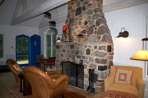
The living room was white white … in fact there was no paint on the walls. Just drywall compound.


The old walls were the horrible swoopy plaster stuff, that was white. In fact it was so white because it had no paint on it. So take a bucket of drywall compound, smear it on your wall and let it dry. That was the color of the walls. I didn’t want white white, but I definitely wanted something that I knew I wouldn’t tire of. (By the way, all the color samples here look really strange and don’t even look all that close to the actual color to me, but just go with it!)

Photobucket
Mascarpone

So the walls and ceiling in the living room will all be Benjamin Moore (all colors are BM, even if they won’t necessarily be painted using BM paint) Mascarpone (AF-20). You may remember this color from my totally boring and seemingly neverending search for the perfect white. This the color that all the trim in the house (except for the bathrooms) will eventually be (when I get to it). It’s a nice warm off-white that I don’t find too creamy or too yellow. I was unsure about the trim and the walls being the same color but then I looked around the Internet a little and it seems that’s quite the trend these days. That’s not why I’m doing it, but hey, I’ll go with it.

Photobucket
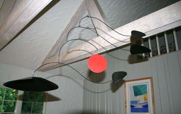
This really bizarre picture of the mobile that came with the house—we liked it so we just left it right where it was—shows the one wall in the living room that is fully paneled. The gray we’re going with will be a little darker and a little warmer than what’s there. Also, that horrible swoopy plaster stuff on the walls is gone! Oh happy day!
gray huskie
Gray Huskie

One full wall in the living room as well as the wainscotting on the other walls is random width paneling. This had been painted a light gray color that sometimes looked white in low-light situations. It didn’t look quite right with the Mascarpone, so I’m taking it a few shades darker and a little warmer with Gray Husky (or Huskie, depending on which fan deck you’re looking at). This paneling is also on the walls in the upstairs hallway that is open to the living room and up the staircase. I was (and am) worried it may be too dark, but I wanted enough contrast to notice it and that will certainly happen with Gray Husky. Incidentally, I’ve been toying with the idea of refinishing the beams, but it’s not something I ever even considered until a week ago or so. I figured it would be safer to live with it for awhile before deciding if they should be refinished. Part of me wants to wait because I don’t know whether to go with a weathered cedar look or just white. So, if anything, that’s a project for the future.

One other thing about the colors for the living room: I have completely tired of the sort of modern French country colors that are currently in the room. I yearn for a crisp navy, tan and off white palette in the worst possible way. Because of this renovation, however, that’s not in the cards at the moment (although it wouldn’t be horribly expensive, but it would require a new couch and two new rugs. I’d recover the chair and ottoman and the coverings on the other other chairs in the room would be DIY projects. Anyway, I chose the colors for the living room with this in mind so that down the road, when we can change things around, we’ll be able to without having to paint yet again.

Photobucket
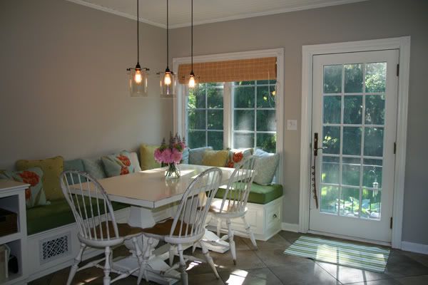
Revere Pewter in the kitchen.

revere pewter
Revere Pewter

In our bedroom I’m going to go with Revere Pewter. This is the same color I used in the kitchen and I really love it. It changes throughout the day from gray to beige but it always feels warm and like a good neutral vs. a lazy neutral (that is, one of those “safe” colors).

Both bedrooms will have wood plank (all the contractors call is car siding, which is a term I’ve never heard before) ceilings painted Mascarpone.

Photobucket
Stonington Gray

The other bedroom, which is going to be yellow, black, gray and white, is going to have its walls painted Stonington Gray.

Pale smoke
Pale Smoke

quiet moemtns
Quiet Moments

The bathroom paint color is still up in the air but I’m looking for a grayed blue or green. I want a color that looks gray when you look at it by itself but skews blue when looked at with the Caribbean blue accent tile that will in there. I’ll be doing tile halfway up the walls so this is only for the top of the walls and the ceiling, which I think I’m going to paint in a 50% dilution of the wall color.

As you can see, it’s all a little gray, but I think there’s enough variation that it will still be interesting. And, as I always remind myself, other than the living room ceiling, it can all be repainted when I leave my “gray” phase.

In case you want to check out the previous construction updates here they are:

Construction Update 1
Construction Update 2
Construction Update 3
Construction Update 4
Construction Update 5
Construction Update 6
Construction Update 7
Construction Update 7.5

house remodel
by Erin @ The Impatient Gardener 
4 Comments

About Erin @ The Impatient Gardener

View all posts by Erin @ The Impatient Gardener

Related Posts

  • Cafe lights offer warmth to outdoor seating areas.Fall cleanup with a healthy dose of cozy
  • DO GARDENS HAVE TO MATCH THE HOUSE?
  • Back in the renovation saddle again
  • The unfinisher strikes again
previous post: Plants of the year: Honorable (and dishonorable) mentions
next post: Lighting the way

Comments

  1. LINDA from EACH LITTLE WORLD says: October 26, 2010 at 10:08 pm

    Suddenly we have lots of gray and gold. One room looks goldish while the other two are definitely in the khaki green family though their names say gold. Gray seems to be an "in" color at the moment which means I am taking advantage of all the throws and pillows and accessories that I can find in gray, knowing it will last for me but soon be over in the marketplace.

    Reply
  2. LINDA from EACH LITTLE WORLD says: October 26, 2010 at 10:34 pm

    A blog for you:

    http://greigedesign.blogspot.com/

    Reply
  3. Katie S. says: November 3, 2010 at 8:42 pm

    We used two shades of gray in our office with a chair rail to break it up. I LOVE it and if we weren't planning ot move I'd paint more rooms various shades of gray. I love some of the shades you have chosen.

    Reply
  4. Katie Skelley says: February 16, 2013 at 9:15 pm

    Okay, I am sold. Revere Pewter for the kitchen! When you said that it changed from beige to grey thru the day, that was exactly what I wanted. And the fact that it is not a lazy neutral, it doesn't look builder basic. Done and done.

    Now, how did you get a BM color without BM paint, do you take the sample to a big box store and get them to mix it up? Because BM is pricey like whoa.

    Reply

Leave Your Comments Cancel reply

Your email address will not be published. Required fields are marked *

This site uses Akismet to reduce spam. Learn how your comment data is processed.

About

The Impatient Gardener

Do you love gardening? Me too! I'm Erin and I garden in Southeastern Wisconsin, zone 5. The Impatient Gardener is all about real-life gardening: the good parts, the bad bits and even the funny stuff. It's part information, part inspiration and a little bit commiseration. Thanks for visiting.

Here's some more about me.

CONNECT

Awards

Garden Comm award

MY FAVORITE GEAR

https://www.amazon.com/shop/impatientgardener

Instagram

impatientgardener

Erin Schanen 🌿 The Impatient Gardener
I fell in love with gardening through container de I fell in love with gardening through container design and it’s probably still my favorite type of gardening. My trip to Philadelphia area gardens was full of so many excellent ideas. For several years I’ve been enamored with clustered pots, but in my opinion they work best when they are able to stand alone in a space. And you probably know me well enough by now to know that as far as I’m concerned, the bigger the pot, the better. Feast your eyes on these beauties and use your zooming fingers to really get into those nooks and crannies. 

Don’t forget to save your favorites because you know you’re going to be looking for them come next spring. 😀

Photos 1 & 2: Amazing container cluster at @longwoodgardens  that works particularly well because of the restraint used in the design. Also how many different ways is the universe going to tell me I need to grow agave before I actually listen?

Photo 3: This was probably favorite display I saw the whole time and of course it’s from the masters at @chanticleergarden This is a master class in texture. It’s also probably not attainable for the average home gardener because it relies heavily on tropicals that need proper overwintering in order to reach a good size. But there’s no reason why I (or you) couldn’t use this as inspiration to create a similar feel with other plants. 

Photo 4: Strappy foliage, bright orange and colorful pots create such a good doorway collection at @chanticleergarden 

Photo 5, 6 & 7: Similar colors were used at a patio doorway at Steve and Ann Hutton’s Owl Creek Farm home garden. A pot is perfectly framed by an arbor off a side patio. The front entrance has a pink theme (and an amazing feature pot that I couldn’t show here because all my shots are vertical). 

Photo 8: Back to @chanticleergarden where I could have studied this container planting for an hour just to soak up all the detail. 

Photo 9: And while I love a pot with a lot going on, never underestimate the power of a simply planted, gorgeous pot, like this one at @abunting64 garden Belvidere. 

#gbfling2023
I think every garden probably needs a little bit o I think every garden probably needs a little bit of water, even if it’s just a bird bath. All of the fabulous gardens I saw recently in the Philadelphia area incorporated water into them. Here are just a few examples of how lovely these water features were. 

@paxsonhillfarm @northviewgarden @brandywinecottage @longwoodgardens #gbfling2023
Gardens must have places to relax and enjoy the vi Gardens must have places to relax and enjoy the view even though we all know that most of us rarely take the opportunity to use them. The seating I saw in gardens in the Philadelphia area reflected their gardens and all were special. 

Make sure to share your favorite!

Photo 1:  I adored these perfectly lichen-covered chairs at @brandywinecottage

Photo 2: Great lichen game on this bench at Wayne Guymon’s mind-blowing garden WynEden. 

Photo 3: Perhaps my favorite seating moment of the whole trip was this chair in @jennyrosecarey @northviewgarden . Not only was it perfectly lichen covered (are you sensing a theme here?) but a volunteer cleome was growing right up through the middle of it. Unfortunately this photo of it isn’t grata because by this point in the trip my phone (I didn’t want to use my DSLR in the middle of the tropical storm so I switched to my phone) was getting very grumpy about the rain. 

Photo 4: I’d be happy to hang out on these chairs in @abunting64 ‘s gorgeous garden Belvidere. I loved this space. 

Photo 5: Color was the name of the game on this patio at Steve and Ann Hutton’s Owl Creek Farm. 

Photo 6: The most original table and benches I saw were at @abunting64 garden. This was a portion of the garden that was actually on the neighbors’ property adjacent to Andrew’s. It had been a vegetable garden but is getting a bit too shady so it will soon have a new life. 

Photo 7: We visited Barbara Tiffany’s Mill Fleurs in a deluge, which is a shame, and dotted throughout the property are examples of her husband Tiff’s amazing furniture. This was, called the Centipede was upholstered and quite different from the others. All were amazing works of art. 

Photos 8 and 9: The @scott_arboretum at @swarthmorecollege had some excellent seating, from brand new @deebenarc chairs to more lichen-covered charmers.

#gbfling2023
*** I can already see that some people do not unde *** I can already see that some people do not understand humor so let me just say this: 1. I was fully aware of the escaped convict situation (I’m an avid follower of the news, which is common for us journalists). 2. It’s ok to laugh about the fact that I’ve missed the Longwood meadow twice through weird circumstances while being a rational adult and realizing that I’m not making light of the situation that led to the meadow being mown. ***

I missed seeing @longwoodgardens beautiful meadow the first time I visited so I was excited to see it the second time. Not so fast! Turns out it had to be mown down during the search for an escaped convict who was hiding out there (at least that’s what I was told was the reason for the mowing). He’ll never see goldenrod the same way again! 😀

That whole situation was really unfortunate for @longwoodgardens (not to mention everyone who lives in the area), which had to be closed for about a week while the hunt was on!
Load More Follow on Instagram

SEARCH

Popular posts

  • HOW TO MAKE A HOLIDAY WINDOW BOX
  • Three ways to grow annual poppies
  • GARDEN TOUR: WHERE CONIFERS AND TEXTURE RULE
  • Slip slidin’ away to trash organization heaven

Find us on Facebook

Archives

  • ABOUT
  • TALK TO ME
  • TERMS & DISCLAIMERS
  • PRIVACY POLICY
  • Home

Copyright © 2023 · Prima Donna theme by Georgia Lou Studios

Copyright 2009-2021 ©The Impatient Gardener