First off, I’m sorry for the radio silence this week after the big bang of two posts on Monday. I had posts all ready to go and then work got so busy I didn’t even have time to hit send.
The other day a friend and blog reader sent me a message in the middle of our intense Words with Friends game asking me how the chair in the living room turned out. She was guessing it wasn’t good since I hadn’t posted anything about it.
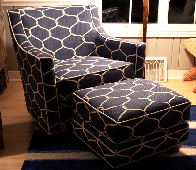
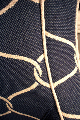
The chair came back a couple weeks ago. First of all, I was thrilled with the reupholstery job. He did a great job matching patterns, which is a big deal to me and I was over the moon happy with my decision to go with the contrast welt.
 |
| The chair at night with lots of lamps on for the icky yellow cast. |
 |
| The fabric has great texture. |
A couple weeks before that, the new living room rug arrived and although it was a little lighter in color than I expected (you never know what you’re going to get when you order online), I also loved that. It was bigger than the old rug and that was good because I really felt like the other one was undersized. I picked the rug mostly because I wanted a striped rug but it had to be tufted. I have had nothing but great luck with tufted wool rugs in terms of cleaning and horrible luck with flat-weave rugs. This rug sees a lot of action and a ton of muddy paw prints so a dark color or a busy pattern was a requirement.
In most rooms that have the look I was going for I think a sisal or jute rug would be perfect, but I had two issues with those: 1.) They aren’t as cozy as I would like. We lay around with the dogs on the rug and I often sit there and do projects that require a big work space. 2.) The light color of our floors makes it very difficult to work with natural material rugs and I wouldn’t take the chance of buying one sight unseen online.
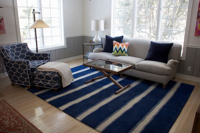
OK, so now we have a rug I love and a chair I love. But guess what? When they met I wasn’t convinced it was love at first sight. I knew I was taking a chance by ordering the rug before I had the chair or vice versa, but my thinking on this room all along has been that all blues (except for those on the extreme ends of blue that are more like purple or teal) get along, so I wasn’t worried if the blues didn’t match. What I didn’t expect was to have a problem with the pattern.
So I lived with the combo for a few days. After a little stewing, I realized I do like it. I think I was in a bit of shock because it was a pretty dramatic change from before and because I’m not a big pattern person. I tend to hide in the safety of solid colors with texture.
Interestingly, when I showed her a picture, my WWF opponent/friend/blog reader said the same thing I had been thinking, “It’s a lot of look.” Thank you Tim Gunn for giving us that phrase. And it is a lot of look, but I think with a few small details it will be a lot of good look.
So that’s why you haven’t seen the room yet. Because I had to make sure I liked it before I’d show it to you. It still needs a little work. I need a little side table for the chair (I’d love to find a small marble-topped table with simple lines). I still need to make some more pillows—one or two more for the couch plus one for the chair, which I think needs to be simple in design and color palette and maybe incorporate some of the burnt orange color in the pillow on the couch and the painting in the corner. I also need to get some art on the wall in the corner by the white lamp to balance things out. As we know, though, art comes slowly to my house.
Putting the afghan on the ottoman also helped break things up too. I use that afghan every night so it’s always handy so it works out to have it there anyway.
And lastly, the other rug in front of the fireplace is about to be replaced and find a new home. It is a lovely rug so I’m happy I have found it a good home, but it just doesn’t work in the room anymore. So avert your eyes from that rug.
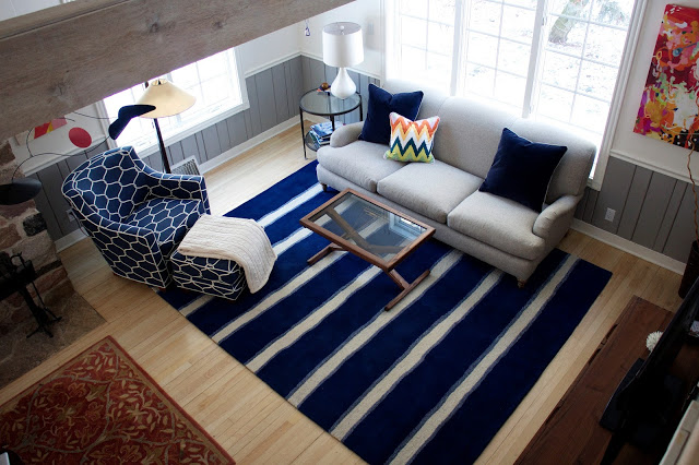
One nice thing about having the story-and-a-half house is that it’s nice to get the overall view from upstairs. I’m not sure what to tell you about the blues in these photos. The rug looks positively royal blue in them and that’s really not the case. I’d say more cadet blue or lighter navy (more like you see in the shaded parts of the rug).
So there it is. Do me favor and don’t tell me if you hate it.
Have a great weekend everyone. I’ve got an itch to do a little painting so who knows what I’ll have to show you next week!


16 Responses
Thank you so much for posting such a detailed and helpful review of this rug on RugStutio! I was debating ordering this rug and then saw your comments about its actual color and the link to your photos of it in your space. I really can't say how incredibly helpful it was to see it in situ.
Beautiful! Do you know the manufacturer of that fabric? I know you got it at Calico Corners, but I was wondering who actually makes it.
Unfortunately I don't know who the manufacturer is. Usually I can find Calico Corners fabrics cheaper online somewhere else but I was never able to find this one anywhere else. I wonder if maybe it wasn't made specifically for them? Sorry I can't be of more help.
They look fabulous together! Personally, I'd add some blue and white ikat or Japanese fabrics for pillow. Go all the way.
Oh, excellent suggestions, Linda! Thank you.
I don't hate it at all! In fact, quite the opposite! No, really, I think the entire set up is beautiful.. very inviting.
Thank you!
I'm loving it. The chair is gorgeous and the rug is fun! Nice work!
Thanks so much Kara!
Oh and I don't know if you'll like this table or not, but I saw it recently at West Elm and loved it.
http://www.westelm.com/products/hex-side-table-g669/?pkey=ccoffee-side-tables&cm_src=coffee-side-tables||NoFacet-_-NoFacet-_–_-
I like and I keep going back and looking at it. I wish it were just a touch taller, but the price is right on it. I wish we had a West Elm nearby so I could pick one out with great marble, but alas, no such luck.
It's beautiful!
Love the rug. Love the chair. Love them together.
I am a huge fan of navy and shades of blue. My dining room is navy blue and I recently told my husband it's my favorite color in our house.
I think it all works really, really well.
Looks great! The chair turned out wonderfully!
Thanks, STacey!
Girl! That is gorgeous! Like Better Homes & Garden gorgeous. You have a gift. I will come organize your house if you will come down and accessorize mine. 😀
I'm not so good at accessorizing either. But I will definitely take you up on the organization offer.