We’ve been enjoying the most amazing stretch of gorgeous summer weather here in southeastern Wisconsin. Save for the fact that we could really use some rain, there is absolutely nothing to complain about. We’ve been savoring every possible moment of it (I seriously try to soak it in and save it for a few months from now), taking walks on the beach, paddleboarding, gardening, dining alfresco and getting to a few small, fun projects that I’ve had on the brain for awhile.
Last year I showed you our
new old-fashioned screen door (that is so fantastic, by the way). I painted it Benjamin Moore’s Wythe Blue, a color that I’d been dying to use on something. Unfortunately the color, which is absolutely lovely in so many applications, fell a little flat in the glaring sun on our all-white house.
So Saturday, I picked (at the hardware store, which is usually not the right thing to do) Benjamin Moore’s Clearlake to update the paint job.
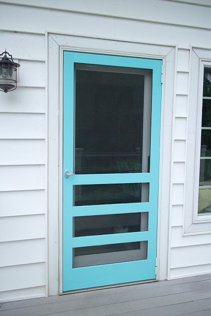 |
| The new screen color: Clearlake, a (really) bright turquoise. |
The whole job took me a total of about 30 minutes. I just took the screen off its hinges, washed it, sanded it very lightly, taped off the screens and applied two coats, with about two hours in between. Usually the recoat time is a lot longer but it was pretty warm out so it dried quickly. With extra dry time, I had the screen remounted by cocktail hour.
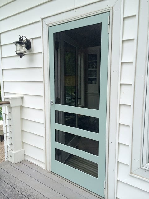 |
| The old color: Wythe Blue, still one of my favorite paint colors, just a tad bland for this application, in my opinion. |
I don’t know if the color is perfect. It’s bright, that’s for sure, and I think it lends a punch of color that the house really needed. What I know is that it was so easy to change that I’m happy to live with bright turquoise for awhile and next summer, if I decide it’s not right, I’ll just change it again. You have to love that about paint.


9 Responses
Love the color. It brings your eye directly to your door. Which I would think you would want it to stand out from the house. It looks inviting.
Thanks, Lisa! I always appreciate your comments.
I love it now…it might not work in the winter. There is, hopefully, a long time between then and now. Enjoy it! I often paint things colors I know I can't live with forever. I believe it's good to keep things moving and changing. Keeps you in love with your house. Truth be told, I've never really met a shade of blue I don't like. I could also see that door being yellow…? I'm going to ruin my white palace of a salon this weekend and paint my main styling station bright orange. Ready for a change 🙂 I know I'll hate it sometime around January.
Maybe I'll do yellow next year. Or citrus green!
Love the color! So fun and summery. : )
You're so right…..the Wythe Blue looks dull – what a shame as it's one of my favourites too. But the new colour is fabulous! Do you remove the screen in the winter? I can't imagine the bright blue in the darkest days of a Wisconsin December.
Yeah, the screen goes away for winter. It would probably look ridiculous in a snowstorm. Although I'm getting to the point where everything looks ridiculous in a snowstorm.
It looks great. You should look for an end of season sale on planters and get a pot that color.
Oh, good suggestion! I did get new cushions for the patio table on the deck that are striped with that color so there is some tie in, but I pot would be perfect. I could always paint one too.