 |
| BEFORE (Wythe Blue door) |
 |
| AFTER (New York State of Mind door) |
Just as I felt like the Wythe Blue was too washed out on the screen door (which I painted a much brighter color a few weeks ago), I never really felt like it was quite right for the garage either. So I went with blue (shocker), but a new blue. It’s Benjamin Moore’s New York State of Mind. You might be thinking that it looks very similar to the Down Pour Blue that’s on the front door and you are probably right but I did something different anyway. The collection of blue paint grows!
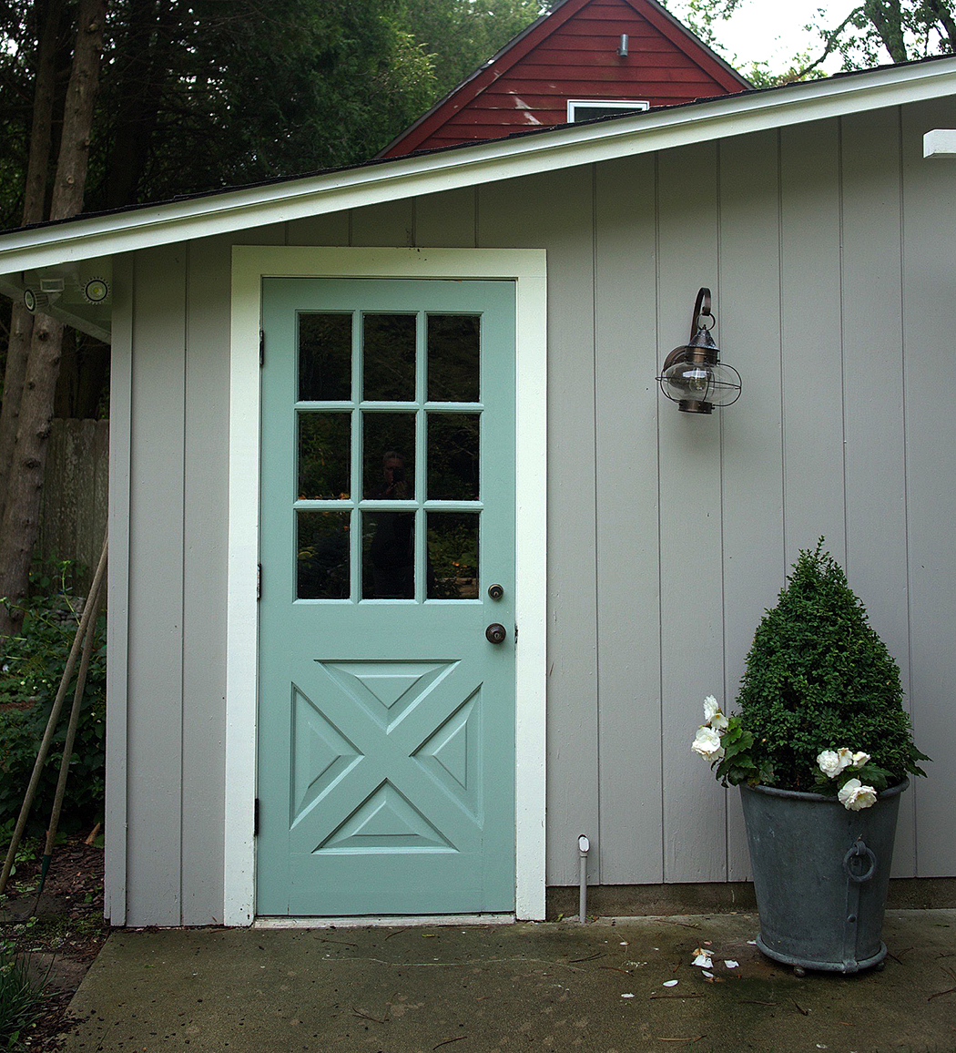

So I absolutely love the color. It’s not too bright and it’s not too navy. It maybe has just a skosh of green in it in some lights, but all around it’s pretty fab.
But I’m not quite sure it’s fab on the garage. I think the dark color is leaving the whole thing feeling very unbalanced. Not to mention there’s a very, “Hey, I’m the service door! Look over here!” vibe to it.
So I’m living with it for a little bit. Frankly, the fix is easy, although I want to make sure to let this paint cure before I go slapping more on. So what do you think? And if it’s not quite right, what is?

10 Responses
I love the color! I think it will look a lot more balanced once you get a climber on the pergola. I also think some blue glazed pots on either side of the garage doors would look awesome (in case you need more blue in your life!).
If you'd rather not paint the door repeatedly until you find the best color, have you tried Color My Room on MyColortopia.com?
No I'll check it out. At some point I suppose I will end up increasing the thickness of the door to an unmanageable level. 🙂
I love it! But I see what you mean about it being kind of an attention grabber where you may not want attention grabbed. What about a deep ivy green? But again, I love the combination of colors. So pretty!
Maybe you should paint your garage doors the same blue. They look pale in comparison. Then your pergola would really pop in white.
You're right about it screaming for attention. But I'm with Elizabeth…..once you get a climber and some blue pots, it will work better. Personalky I love the deep colour.
I think it's a more business-like color. Very attractive but the old color was more playful and fanciful for a garage, so it made the whole building feel lighter and less like a garage.
I'd also say add more of that blue in pots or flower color or something. There's a ''rule of 3' in quilting: if you have a color in a quilt, use it at least 3 places.
What color is the gray paint? I like it.
Thanks Ali. It's Benjamin Moore Ozark Shadows.