First, the lesson: Black is not black.*
I discovered this lesson when I set out to repaint the inside of our back door, that opens to our kitchen.
You may recall that the first time I painted it black, I did so on a whim and over cocktail hour. There’s a chance I may not have done a good job on my prep and I think it’s safe to say we can and should blame the Cabernet for that. Anyway, that paint job was chipping and getting a bit scratched up so I figured I’d redo it the right way this time.
I sprung for very expensive Fine Paints of Europe Eco Brilliance paint. After sanding and priming, I put a coat of the insanely high gloss paint on. The color was to die for. The most amazing black (just “Black” in FPE parlance) that was deep and rich and just lovely. The first coat didn’t go on well, but that’s to be expected with dark paints. The second coat went on weird. It was all lumpy in some spots. The third coat (sanding between coats) only made it worse. Something was horribly wrong.
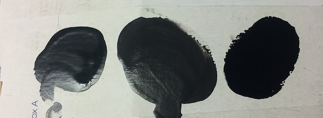 |
| You can sort of tell the issues with different paint colors in my little finger-dip paint testing method. I can’t remember which two Ben Moore colors the first two are, but the color farthest to the right is Fine Paints of Europe’s Black and it is utterly gorgeous. |
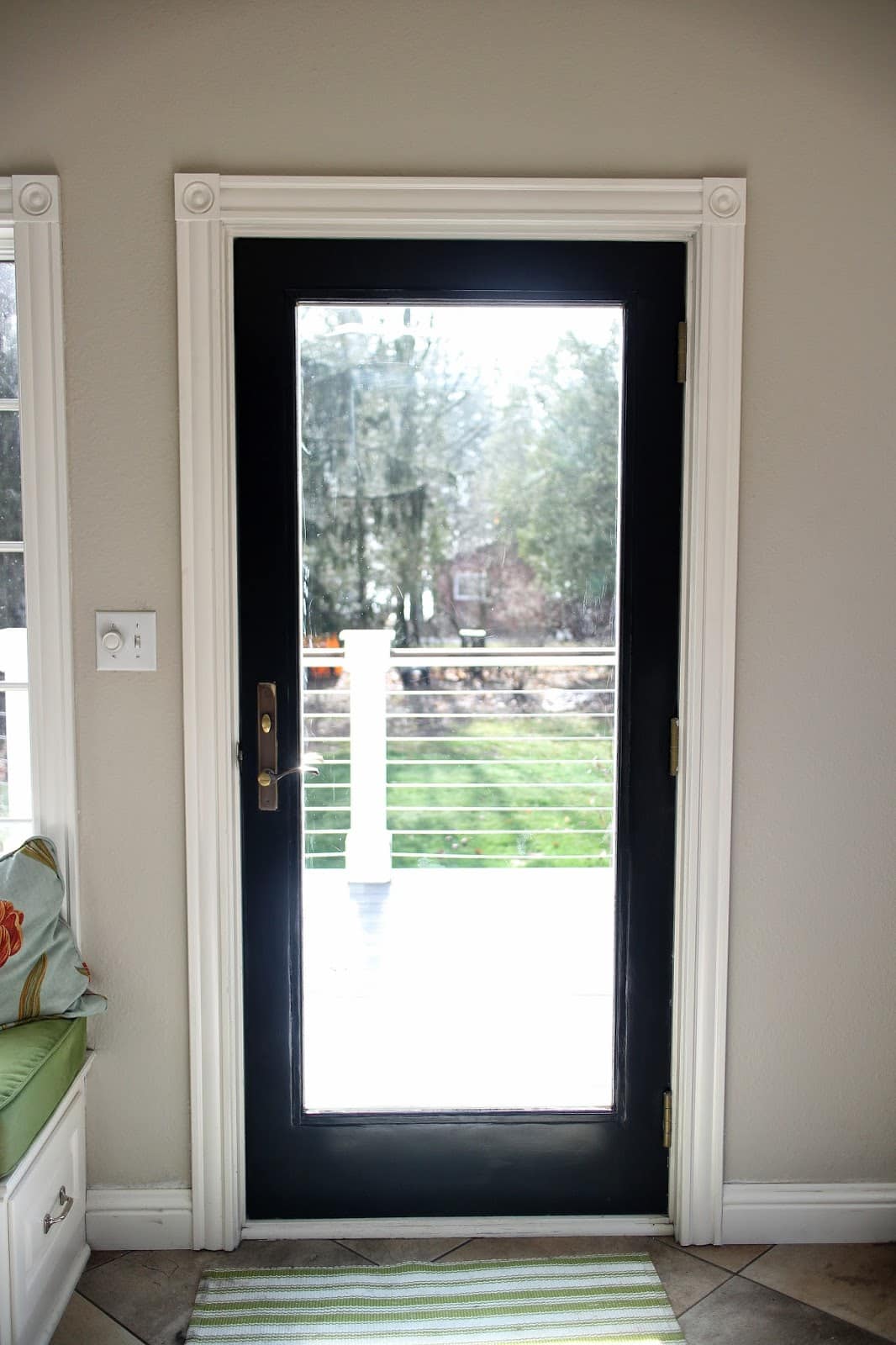 |
| All that and we’re back, more or less, to where it was, sans scratches and chipping. Looking at this photo, I realize I need to touch up some of the baseboards. Sigh. Another day. |
It’s still not as nice and rich as that gorgeous FPE paint, but sometimes it’s a compromise. And for me, a good paint job in a not-perfect color is better than a great color that looks like a mess.
I know you’re wondering why I didn’t just paint it the same black it was. Would you believe I don’t know what color that was? I actually gave the can away to my nephew for a project so I don’t have it and I didn’t make note of it in the blog. Looking back at those photos from when I first did it, I think the original was actually darker. Which goes back to the theory that something has changed with the paint colors or pigments or machines since then.
The lesson? I don’t think I’ll use Benjamin Moore paint if I want a true black in the future. And if you do use it and you want a real black, find a nice paint guy who will just load up the can with as much pigment as you think it can handle.
* When it comes to paint, anyway.
P.S. Longtime readers may remember that I once posted an entry with almost the same name (or exactly the opposite depending on how you want to look at it), only about white. Maybe I should stick to gray.
3 Responses
We did the same thing to the front door at our house- black door/white trim. I lucked out and found paint designed to be on the outside of doors and it was the perfect shade of black- straight off the shelf. But had the same experience you had with an indoor black paint we tried first- way too much blue tint to it.
I know what you mean about the black. I painted my front door in BM black and it's not quite black enough. But unlike you, I don't have the patience to do it again. I love how the black frame around the glass makes your outside view look like a picture. Gorgeous!
The sun is shining right now at our place. Correct that, I just took a peek out the window and it's greyed over again. Darn.
I am trying to make it a rainy day project to record all of our paint colors. A lot more work than it sounds like, I bet.