Welcome to Week 2 of the
One Room Challenge. I’m “playing along” as a guest participant in the blogging event that has people making over a room in six weeks and linking up via Calling it Home.
In Week 1 (which I just published a couple days ago) I laid out the room, the issues, the challenges and a very rough design concept. But any renovation of that room would fail if I didn’t deal with the main issue in the room: the floor.
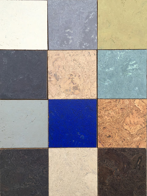 |
| A variety of the colors available from Globus Cork that we considered for the project. Top row: Alabaster, Ocean Fog, Pisello; Second row: Slate Gray, Bleached, Sage; Third row: Cement Gray, Ocean Blue, Natural; Bottom row: Graphite, Whitewashed, Sable. |
The existing floor—pink and blue sheet sheet vinyl—could be described as hideous at best. This was not something that I could just design around. And honestly it wasn’t really the best kind of flooring for this space. In fact, flooring in this space has a long list of qualities it needs to have:
- Durable. This is a hard working space because we are constantly walking back and forth through that space to get to the utility side of the basement.
- Able to deal with water issues. We have two sump pumps in the basement—one on each side—that manage the rare water issues we have down there. That side of the basement has never had a real water problem other than the one time the sump pump failed, but it’s a basement, so water can happen.
- Add warmth. The basement isn’t well insulated and although there is heat down there, the space is naturally cooler than the rest of the house.
- Dampen sound. Even with low ceilings, the acoustics are not the best. Couple that with the likelihood that the washer or dryer could be running in the next room, or the furnace may kick on and it’s not exactly super quiet. Anything that can help dampen the sound would be good.
Vinyl (doesn’t solve any other than the water issue), wood (warm but nothing else), carpeting (no way, never near a potential water issue) and tile (durable, but misses the mark on the rest of the requirements) were out. In fact there was only one kind of flooring I could come up with that actually fulfilled all the requirements: cork.
I love cork floors. Our family cottage used to have them when we were growing up and they survived soaking wet kids full of sand from the beach, wet towels left for days, several months with no heat and more. Back then cork floors were the color of cork, not unlike a bulletin board. Which is not bad, but doesn’t work in every space.
But now, cork can be found in just about every color under the rainbow. I reached out to
Globus Cork to work with on this project in part because they offer hundreds of color and texture combinations. The fact that their cork tiles are easy to install, meaning we could do it ourselves, was a bonus.
Globus Cork is providing flooring for this project so that I can tell you about the process of choosing it, installing it and living with it. Of course all opinions are my own.
Globus Cork offers more than
40 colors of cork in three textures, all of which can be cut in custom patterns. You know how they say that sometimes having more options is worse than fewer? Honestly there is so much to choose from that it can be a little overwhelming, although a
project gallery on the website helps spark the imagination.
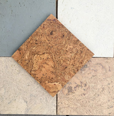 |
| The neutral options we considered (clockwise): Cement Gray, Alabaster, Bleached, Whitewashed and Natural in the middle. |
I knew I didn’t want a basic solid-color floor for the basement. I felt like it would be a missed opportunity to not do something a little out of the ordinary for a space like this, so I ordered several color options to get a feel for just how bold we wanted to go. And although we played around with some of the blues and greens, I’ll admit, I’m just not a good enough designer to know how to make something like that work for the long term. I think plenty of people could make a floor to die for that is very bold and exciting and even timeless, but I don’t trust changing tastes enough for that.
So we quickly narrowed down the options to a more neutral palette, and one that was light in color because we need to do everything we can to make that space feel brighter and larger. Although I liked Cement Gray, it seemed like the oddball out among the neutral options we pulled, so we nixed that. And I loved Natural, but there was a warmth to it that didn’t work well with the stone in the fireplace, so I pulled that out of the running as well. Then it was a decision of whether we wanted two or three colors.
I think we could have made any pattern look really nice with a combination of Alabaster, Whitewashed and Bleached, but my concern was that the floor might get too busy. So we narrowed it down to two: Alabaster, a cream color, and Bleached, which is basically bleached natural cork (the two end tiles shown above).
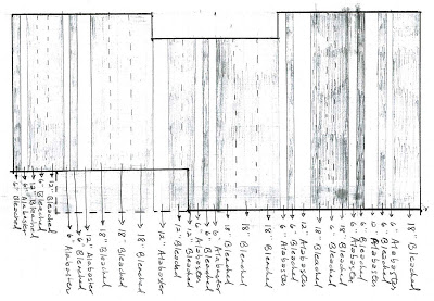 |
| Here’s the diagram we made showing what we plan to do with the random stripe design. Nothing like making things complicated. |
As for the pattern, I thought a stripe going across the room might help the space appear a little wider than it was and, for no reason other than to do something a little different, I opted for a random stripe. The design will be about two-thirds Bleached and one-third Alabaster, with stripes of random width and placement.
On paper is one thing, but we’ll see how it looks in the space. It’s liberating to be doing something a little out of the ordinary and I think it will help turn a very basic space into something a little special.